Webflow Training Hub
Welcome to your website reference guide. This is your go-to resource for managing your site confidently and independently. Everything on this page covers tasks you can handle yourself without a developer.
If you ever want to do something that isn't covered here, contact your website developers at {{Pixels contact info}}.
Understanding Your Webflow Role
Everyone on your team must be been given a role that determines what they can do in Webflow. If someone needs an invite or you need any sort of team changes, contact your company's Webflow administrator at marketing@relay.edu. Here's a quick overview for each role:
Marketer (build mode):
You can create and edit pages using components, update content, and manage publishing. This is the most active editing role.
Learn more from Webflow here
Content Editor (edit mode):
You can edit text, swap images, and manage CMS content (like workshops and articles) directly on the canvas. You can't change layouts, styles, or site structure. This is by design, and keeps things safe.
Reviewer:
You can view the site and leave comments on specific elements. This is the right role for stakeholders who need to see work in progress and give feedback without making changes.
Learn more from Webflow here
Note - you may see references to the "designer" role or "design mode" in documentation created by Webflow. This is the role for your site developers (or anyone who has full access to change the design or the building blocks of the site). We will refer to them here as "developers".
Webflow Overview
More info about the different features here in Webflow. Not all roles have the same access to every feature.
Tour of the interface
Overview of the interface here in Webflow. This interface does get updated from time-to-time, so things may move around from what you see below.
.jpg)
- Webflow dropdown
- Mode badge (based on your role it will likely say "Build" or "Edit")
- CMS button - Learn more about the CMS
- Insights button - Relay does not currently have access to the Insights feature. Learn more about this feature here.
- Pages dropdown (quickly navigate to any page)
- Active editors (icons for team members currently in the site)
- Comments access - Learn more about comments
- Preview - Learn more about preview mode
- Share site - Learn more about sharing
- Publish dropdown - Learn more about publishing
- Undo/redo
- View site on different breakpoints (tablets, phones)
- Pages panel - Learn more about the pages panel
- Navigator panel - Learn more about the navigator panel
- Components panel
- Assets panel - Learn more about assets
- Canvas
- Settings (site search, which Relay does not use and interface settings, like dark mode)
- AI learning assistant
- Quick find (can help you quickly find things like components, pages, and CMS collections)
- Video tutorials
Publishing in Webflow
Publishing in Webflow refers to pushing your site's changes live so that visitors can see them. There are a couple of different environments to understand here. See Webflow's video on publishing to staging and production.
The Webflow Subdomain (Staging) is a free URL that Webflow provides for every site. Yours is relay-edu-2026.webflow.io. This is great for previewing your site in a real browser environment and sharing progress internally before anything goes live on your real domain. Publishing to the subdomain doesn't affect your live production site.
Your Custom Domain (Production) is your real, public-facing website (www.relay.edu). Publishing to your custom domain is what makes changes visible to the general public. This is your production environment, and you should be confident in your changes before publishing here.
When you hit the Publish button in Webflow, you'll be given the option to choose which domains to publish to — so you can push to your staging subdomain first to review everything, and then publish to your custom domain when you're happy.
A few things worth keeping in mind — publishing applies to the whole site, not just individual pages, unless you are only publishing a single CMS item within the CMS. Anyone with a marketer or content editor role can publish unless your Webflow administrator has turned off permission to do so.
Getting into the habit of checking your staging subdomain before publishing to your custom domain is a simple but effective way to catch any issues before your audience sees them.
Pages Panel
Access any of the existing site pages, page templates, CMS pages, and utility pages via this panel.
Add a new page using the plus icon. Search through pages using the search bar.
Hover over a page and a settings/gear icon will appear. Clicking this will give you access to that page's settings panel.
Learn more about the pages panel and page settings from Webflow.
Components Panel (Marketers only)
Search and access all available components. These can be added within any available page slots OR within slots inside of components that are already in a page slot.
Page slots can only be added by developers.
Assets Panel
This is where images and documents live. Upload new images, search, edit, remove images here. See Webflow's help center article about the assets panel for a deep dive.
Note: Images inside of your CMS are NOT contained within this assets panel. You'll find those only by going to the specific CMS item.
The Asset Panel in Webflow is where all of your uploaded files are stored and managed — things like images, docs, and other files that are used across your site.
You can access it from the left-hand toolbar. From there you can upload new files, search for existing ones, and drag assets directly onto the canvas to add them to your page.
A few key things to know about the Asset Panel:
It's site-wide, meaning all assets you upload are available across every page of your site — you don't need to re-upload the same image for different pages.
You can organise assets into folders, which becomes increasingly useful as your site grows and your asset library gets larger. Keeping things organised (for example, grouping images by page or content type) makes it much easier to find what you need later.
You can also update an asset by replacing it — if you upload a new version of an image with the same name, you can replace the existing file and it will automatically update everywhere that image is used on the site. This is a big time-saver.
It's worth being mindful of what you upload and keeping the panel tidy. Unused assets still take up storage space, so periodically reviewing and removing files you no longer need is a good habit.
Always compress and resize images — the Asset Panel is the gateway for all media onto your site, so good habits at this stage keep your site lean and fast. Using the modern .webp or .avif image formats helps reduce file weight. You can also use a tool like tinypng.com to help compress images.
Note: Images inside of your CMS are NOT contained within this assets panel. You'll find those only by going to the specific CMS item.
Building Pages (Marketers only)
Those with the role of "marketer" can confidently and quickly build and edit pages in a drag-and-drop experience using the templates, components, and other building blocks that your development team created — with no worries about breaking the site. Learn more from Webflow here.
The following video is geared more towards developers who are setting up all of the building blocks for marketers to work with, but it can be a good overview for marketers to also watch and gain some behind-the-scenes understanding. Or just skip to the 5-minute mark to see build mode in action.
How to add a new page
Create a NEW page:
- Open the pages panel (P on your keyboard)
- In the upper-right corner click on the + icon and select “create page”
- A panel with the settings for this new page will open
- It’s recommended to begin your page from a Template. Select the template dropdown and choose the “Page Starter - Design mode” template.
- Fill in the page settings. Give it a name (only used inside of Webflow), slug, SEO meta title, description, open graph image, etc. This panel also lets you choose whether you want the page to be indexed in the sitemap (and, therefore, Google or other search engines).
- To create the page, use the “Create” button in the upper corner of the page settings panel. You can choose to create the page as a draft as well, but you’ll need to change this to “stage for publish” when you’re ready to publish it.
Duplicate an EXISTING page:
- Open the pages panel (P on your keyboard)
- Hover over the page you want to duplicate and select the gear icon that pops up (this opens the page’s settings)
- There is an icon next to the “close” button in the panel for the page settings that looks like two pieces of paper stacked. Select this icon.
- A new page setting panel will open up for the duplicated page. Go through and update all of the settings and then select “create” in the upper corner of the page settings panel. Or choose to create the page as a draft.
Using components
More information on Components from Webflow.
What is a component?
A component is a reusable building block—formerly known as a "Symbol". It allows you to create an element once, reuse it anywhere on your site, and update it globally OR by an individual instance (via properties).
Where can you find components?
A full list of components can be accessed from the component panel (Shift A on your keyboard). You can also peruse the Components for Marketers page and the More Layout Ideas page.
Component properties
A property is a customizable attribute that lets you change specific content or settings on individual instances of a component without breaking its connection to the main, site-wide design.
Component variants
Think of variants like different states, styles, or variations of a component. Instead of duplicating elements to create near-identical components (like light vs. dark buttons, or horizontal vs. vertical cards, large or small text), variants offer these different design states in one place. Developers must build each component variant, so if you find you are missing a variant that you'd like to have access to, you'll need to reach out to your dev team.
The component system
This Website was built using a component system, giving you plenty of flexibility to build pages as you see fit without needing to know how to develop from scratch.
The building blocks of this component system are the Section, Container, Row, and Col components. Using these building blocks, you can create a nearly endless number of page layouts.
Other available components include utility wrappers, text elements, and other UI elements. Each of these has its own properties and variants.
Nesting components
If there is a "slot" inside of a component, it means you can drop another component inside of it. This is how to nest components to create the layout you are looking for. Start with a section component and then add a container inside of it. Inside of containers you can add rows and inside of rows you can add columns. Columns can house many other components like cards, lists, tabs, accordions, images, headings, buttons, etc.
This video that primarily goes over how to use the Color Wrapper utility component, also shows the concept of "nesting" components to achieve the layout you're trying to build.
Single-instance updates versus Global updates
Updating the settings for component properties only affects the single instance.
Updating something in a component that isn't tied to a property means that you are changing it globally (for EVERY instance of the component used across the site now and in the future).
Webflow's editor mode allows you to make some global changes to components, like changing text, that your developers did not tie to a property. This setup is generally intentional, but if you run into any issues or need to make a global change that is more complex, reach out to your site developers.
Copy/pasting existing layouts
Check out the layout ideas page to easily find different layouts to copy/paste onto your page. You can also copy and paste from any page on the site if you find a layout you like.
Setting up Tabs
Setting up Tables
Setting up Popup Modals
Utility Wrapper Components
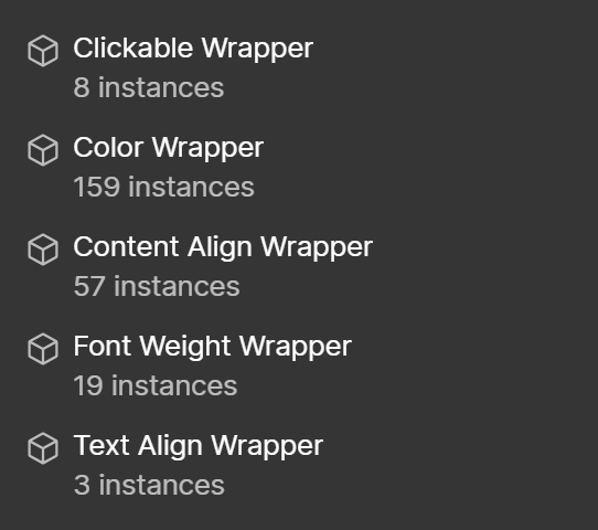
Utility Wrapper Components are components that control a specific aspect of any components that are nested within them, with exception to the Clickable Wrapper, which also affects its direct parent element.
Clickable Wrapper -This makes its whole parent & all siblings clickable. It can be a link tag (or a button tag if the url field is left empty). It has hidden text that is readable by screen readers and has a z-index: -1 only in designer view to keep any relative content clickable.
Color Wrapper - Control the color of child elements, affects either background or text color depending on variant selected. See the following video that goes over how to use the color wrapper component.
Content Align Wrapper - This wrapper groups components inside of it and has variants for stretching across, aligning left, aligning center, or aligning vertically center (does NOT affect text alignment)
Font Weight Wrapper - Controls the font weight of any child components (make text bold, for example).
Text Align Wrapper - Has text alignment options for left, center, and right.
Partner logo carousel on the home page
The funcionality for this slider carousel is already set up for you. If you'd like to modify which partner logos are showing, how many are showing, or their order of appearance - you have the ability to do so.
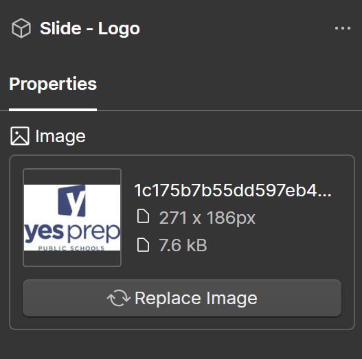
First, you'll use the navigator panel to select the slot that is labelled "Add swiper partner logo slides". You can then add the "Slide - Partner Logo" components inside of this slot. There are already some inside, so feel free to copy/paste to duplicate another item and update the properties to the logo you want to show.
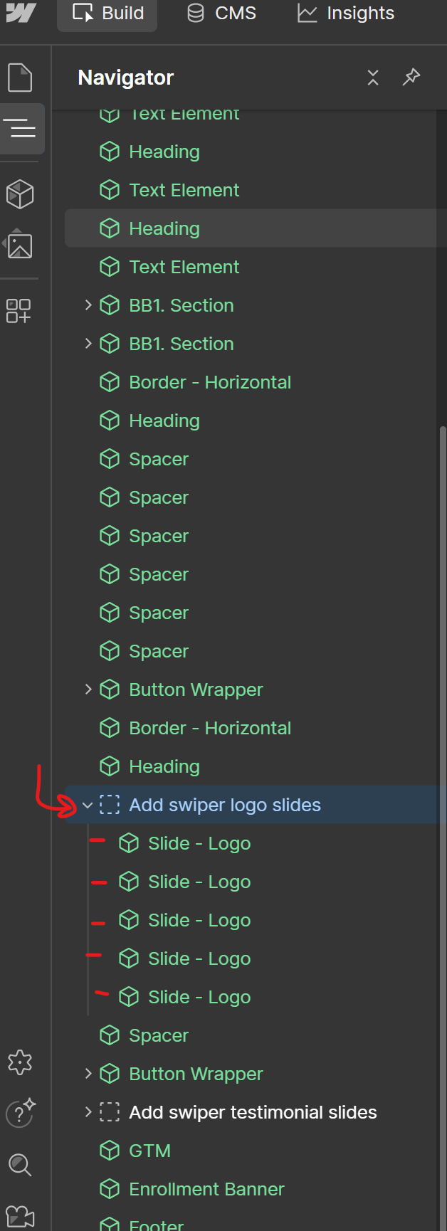
The only property to update for the "Slide - Logo" component is the logo image, itself. Don't forget to add Alt Text for the image as well (do this when you upload the image to the asset panel).
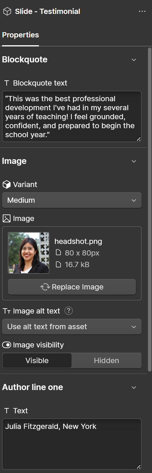
Testimonial carousel on the home page
The funcionality for this slider carousel is already set up for you. If you'd like to modify which testimonials are showing, how many are showing, or their order of appearance - you have the ability to do so.
First, you'll use the navigator panel to select the slot that is labelled "Add swiper testimonials slides". You can then add the "Slide - Testimonial" components inside of this slot. There are already some inside, so feel free to copy/paste to duplicate another item and update the properties to the testimonial you want to show.
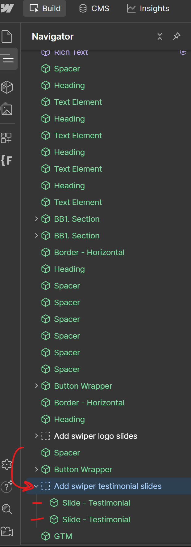
Next, fill out the properties for the "Slide - Testimonial" component to show the testimonial that you want to feature in the slider/carousel.
Adding a new location
Location items have two main pieces to set up.
- The page for the location
- The CMS item for the location
Location page: The easiest way to set up a new location page is to duplicate an existing one. See more about adding a new/duplicating a page here.
Location CMS item: Open the CMS panel and navigate to the "Locations List" collection. Add a new item and fill out the required fields. Pay close attention that you are adding the correct page url slug.
Single CMS Testimonial component
This component connects to the "Testimonials" CMS collection. You can filter by either the CMS item's name or the author name to show the specific testimonial's content in the component.
*Important note* if you change the item name or author name in the CMS, any instance of this component that is using that data will break. It's always safest just to create a new testimonial item in the CMS.
Components for developers
In your components panel, there is a group of components labeled "For Developers". These are components that we do not suggest you attempt to use. If you have questions, reach out to your development team.
CMS Overview
Resources from Webflow on the CMS
The following resources (videos, articles, etc) are created by Webflow that can dive deeper into the what and how of the Webflow CMS.
CMS Collections
A CMS Collection in Webflow is essentially a database of structured content. Think of it like a spreadsheet where each row is a piece of content (like an article post, workshop item, or leader profile) and each column is a field that defines its properties (like title, date, image, or description).
Collections are ideal for any repeating content that follows the same structure. Instead of building a separate page for every article by hand, your developers created one template page that automatically pulls in the right content for whichever item someone is viewing.
A practical example: A "Blog Posts" collection might have fields for Title, Author, Published Date, Cover Image, and Body Text. Every post you add to that collection automatically gets its own page, and any design changes you make to the template apply to all posts at once.
In short, collections keep your content organised, consistent, and easy to update — without needing to touch the design every time you add something new.
CMS Items
If a CMS Collection is the structure (the "spreadsheet"), then a Collection Item is a single entry within it (a single "row").
Using the blog example from before — if "Blog Posts" is the collection, then each individual blog post is a collection item. Each item contains its own unique content, but it always follows the same structure defined by the collection's fields.
So when you want to add a new blog post, you're creating a new collection item. You fill in the fields (title, date, image, etc.) and Webflow automatically generates a page for it using the page template for CMS collection. When you need to edit or delete a post, you find that item in the collection and update it there.
CMS Item Best-Practices
Here are some good habits to build when adding content to a Webflow CMS collection.
Be consistent with formatting. If your collection has a field for titles, decide on a style (e.g. title case or sentence case) and stick to it across all items. Inconsistencies become very visible when content is displayed together on a page, like in an overview list.
Always fill in required fields — and the important optional ones too. Some fields may be optional but still important for how the site looks or functions, like SEO titles and meta descriptions, or Open Graph images for social sharing. It's easy to overlook these when adding content quickly, but they make a real difference.
Use slugs thoughtfully. A slug is the URL for that item's page (e.g. /blog/my-first-post). Webflow generates one automatically from the item's name, but it's worth reviewing it — keep it short, descriptive, and lowercase with hyphens. Avoid changing a slug after an item is published, as this will break any existing links to that page.
Optimise your images before uploading. Large image files slow down your site and increases the site's data usage (which Webflow charges for if the site goes over the threshold). Resize and compress images to appropriate dimensions before adding them to a collection item. A handy free tool for this is TinyPNG (tinypng.com). As a rough guideline, aim to keep individual images under 500KB where possible, and ideally under 200KB for smaller images like thumbnails or profile photos. Converting to a more modern image format like .webp is also a great idea!
Drafting, Publishing, Archiving, and Deleting CMS Items
When managing collection items in Webflow, there are four key states and actions to understand.
Draft is the default state when you create a new item. A draft item is saved in your collection but won't be visible on your live published site. This is useful when you're still working on a piece of content and aren't ready for the public to see it yet.
Publishing is the act of making an item live on your site. Once published, the item will be visible to visitors. It's worth noting that saving changes to an item in the Webflow editor doesn't automatically update your live site — you need to publish for those changes to go live.
Archiving is a way to hide an item from your live site without permanently deleting it. An archived item is removed from public view but stays safely in your collection, so you can restore it later if needed. This is handy for seasonal content, outdated offers, or anything you might want to bring back one day.
Deleting permanently removes an item from your collection. Unlike archiving, this can't be undone, so it's worth being sure before you delete something. Any page or content associated with that item will no longer exist on your site.
As a general rule of thumb: use drafts while building, archive when something is temporarily irrelevant, and only delete when you're certain the content is no longer needed.
Sorting and Filtering CMS Items
When you have a growing collection with lots of items, finding what you need quickly becomes important. Webflow's CMS panel has some handy built-in tools to help with this.
These tools are purely for your own navigation inside the CMS panel — they don't affect how content is displayed on the live site. Controlling the order and filtering of items on the actual website is handled separately through collection list settings in the Designer (typically handled by a developer).
Searching is the simplest way to find a specific item — there's a search bar at the top of the collection that lets you filter items by name as you type. This is great when you know exactly what you're looking for.
Filtering lets you narrow down items based on their status. You can filter your collection view to show only draft items, only published items, or only archived items. This is particularly useful when you want to review everything that's currently live, or check what's still sitting as a draft waiting to be published.
Sorting allows you to reorder how items are displayed in the panel. To sort by a particular column, simply click the column heading — for example clicking the "Name" column will sort items alphabetically, and clicking the "Created" column will sort by the most recently created items. Clicking the same column heading a second time will reverse the sort order. This can make it easier to spot recently changed items or find things when you don't remember the exact name.
Pinning fields is a useful feature when your collection has many fields and you want to see specific ones at a glance in the CMS panel without having to open each item individually. By default, only a couple of fields are shown as columns in the panel view. To pin a field, click the "pin" icon at the top right of the column headers — this will show you a list of all fields available to be pinned in the collection, and you can toggle which ones appear as columns. This is handy if you regularly need to check or compare a specific field across many items, like a publish date, a category, or a status toggle, without having to click into each item one by one.
SEO in Webflow
Meta titles and descriptions
A video resource from Webflow that goes over how to add proper meta titles and meta descriptions for your pages and CMS items:
Schema markup
A video resource from Webflow that goes over what schema markup is and how to add it to your pages and CMS templates:
Headings (levels, order, etc)
Headings are the titles and subtitles you use throughout your pages — things like "About Us" at the top of a section or "Our Services" above a list of offerings. In Webflow (and on the web in general), headings aren't just styled text — they have specific hierarchy or levels (H1, H2, H3, H4, H5, H6) that create a structure for your page.
Getting this structure right is important for two reasons: it helps search engines understand your content, and it helps people using screen readers navigate your site.
The Rules
One H1 per page. Every page should have exactly one H1 heading — think of it as the main title of the page. This is usually the first thing visitors see when they land (e.g. "Welcome to Acme Co." on your homepage, or "Our Story" on your about page).
If you have multiple H1s on a page, search engines get confused about what the page is actually about. And screen reader users lose the clear "starting point" they rely on to understand the page structure.
Headings go in order. After your H1, the next headings should be H2s. If you need a subheading under an H2, use an H3. Under an H3, use an H4 — and so on.
Think of it like an outline:
H1: Main page title
H2: Major section
H3: Subsection within that major section
H4: Detail within that subsection
You should never skip levels. For example, don't jump from an H2 straight to an H4 — always go H2 → H3 → H4.
It's not about how it looks. The heading level and the visual size are separate things. An H3 might look bigger than an H2 on your site because that's how it was designed — and that's fine. What matters is the hierarchy, not the appearance.
If a heading looks too big or too small, don't change the heading level to fix it — that breaks the hierarchy. Instead, change the size variant in the heading component property.
How to Set Heading Levels in Webflow
Inside of rich text component: Highlight the text you want to become a heading and select the correct level from the settings panel that appears.
Inside of the heading component: Choose the heading level and the heading size style from the component properties.
Why This Matters
For SEO: Search engines use your heading structure to understand what your page is about and how the information is organised. A clear hierarchy helps them rank your content accurately. Pages with messy or missing heading structures often perform worse in search results.
For accessibility: People using screen readers rely on heading structure to navigate your site. Screen readers can jump between headings to quickly find the section they're looking for — but only if the headings are marked up correctly. If your headings are out of order or misused, you're making your site harder (or impossible) to navigate for these visitors.
A Quick Example
Let's say you're editing your Services page. Here's how the heading structure might look:
H1: Our Services (the main page title — only one per page)
H2: Web Design (a major section)
H3: Custom Design (a subsection under Web Design)
H3: Template Customisation (another subsection under Web Design)
H2: Branding (another major section)
H3: Logo Design (a subsection under Branding)
H3: Brand Guidelines (another subsection under Branding)
Notice how:
- There's only one H1
- Major services are H2s
- Specific offerings under each service are H3s
- The levels never skip
Page redirects
Misc.
Site Accessibility
Relay's site was built to be accessible for those with vision impairments or who may be using screen readers. Much of this is already baked in. However, there are some pieces that must continue to be maintained by editors.
1. Give sections appropriate ARIA labels
What is an ARIA label? ARIA stands for Accessible Rich Internet Applications. An ARIA label is a short text description you attach to an element — in this case a section or region of your page — that screen readers announce to the user. This helps people understand the purpose of each section as they navigate through a page.
Why does it matter? Sighted users can quickly scan a page and understand its layout visually — they can see there's a hero section, then an about section, then a contact form, and so on. A screen reader user navigating with a keyboard doesn't have that luxury, so ARIA labels give them the same sense of structure and orientation.
How to add them to your site — select the section component that you want to label and you'll find a property called "Aria-Label". Enter a descriptive value like "About Us" or "Contact Form" or "Testimonials."
Tips for writing good ARIA labels — keep them short and descriptive, and make sure each one is unique on the page. They should describe the purpose of the section rather than just its appearance. For example "Our Services" is more meaningful than "Middle Section."
It's a small addition that makes a meaningful difference to how accessible and navigable your site is for all users.
⚠️Note: if you copy/paste an existing section, make sure to update the aria label!
2. Give images appropriate alt text
Accessibility is the primary reason for alt text. Screen readers — tools used by people with visual impairments — read alt text aloud to describe images to the user. Without it, someone using a screen reader would simply encounter a blank or unhelpful reference where an image should be, which makes for a poor experience.
SEO is another benefit. Search engines can't "see" images the way humans do, so they rely on alt text to understand what an image contains. Good alt text helps search engines index your content more accurately, which can contribute to better search rankings.
How to write good alt text — aim to describe the image clearly and concisely, as if you were explaining it to someone over the phone. For example, rather than writing "image1.jpg" or just "photo", you might write "A barista pouring latte art in a busy café." Keep it brief — usually a sentence or less — and avoid starting with "image of" or "photo of", as screen readers already announce that it's an image.
If an image is purely decorative and adds no meaningful content (like a background texture or a divider graphic), it's actually best practice to set this image as "decorative" rather than describing it, so screen readers can skip over it without cluttering the experience.
In Webflow, you can add alt text to images directly in the Asset Panel when uploading, or via the image settings when an image is selected on the canvas.
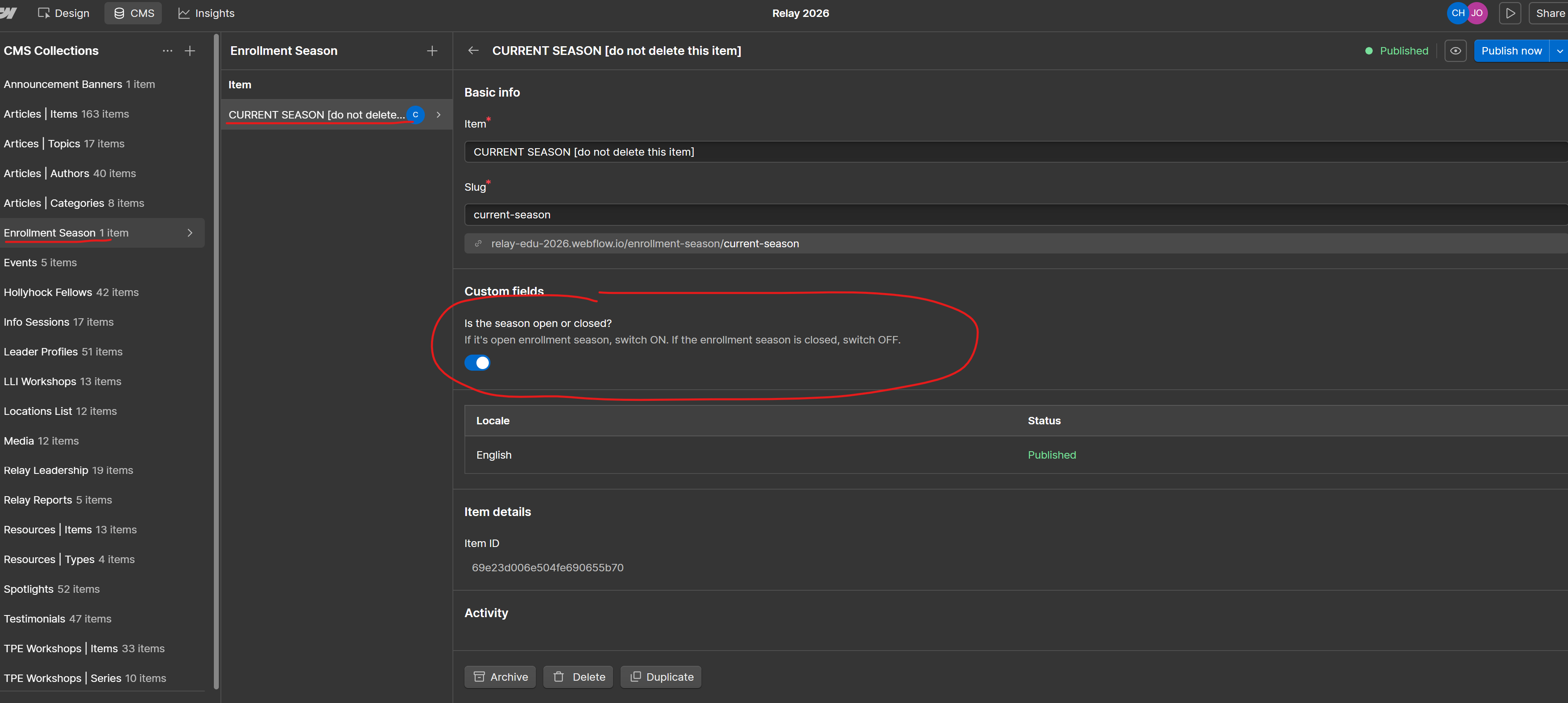
Application/Enrollment Season
The site is set up with the functionality to either globally hide or globally show different elements that relate to Enrollment Season. As of this write-up, these elements include the "Apply" button in the site's main menu and Ithe Enrollment banner that shows just above the footer on most pages across the site. Do not go to any page and delete these elements yourself.
Enrollment Season:
If it is currently enrollment season and you want these elements to be visible, go to the CMS collection named "Enrollment Season" and select the only item within this collection. You must NOT rename this item, remove it, or add any other items to this collection. When you are ready, toggle the switch field for this item to ON and publish your changes.
Not Enrollment Season:
If it is currently NOT enrollment season and you want these elements to be hidden, go to the CMS collection named "Enrollment Season" and select the only item within this collection. You must NOT rename this item, remove it, or add any other items to this collection. When you are ready, toggle the switch field for this item to OFF and publish your changes.
Site Menu and Footer
Updating your website's main navigation menu or footer. You can change top-level text and links, but you're unable to edit items within dropdowns or add/remove items. You'll need to contact your development team to make any significant changes to these components.
Announcement Banner
To show the announcement banner that appears under the navigation menu across the site, head over to the "Announcement Banners" CMS collection.
Create an item and add the content you want to show. Be sure not to make this content too long or it will take up too much space on the page. You can select to show the banner only on the home page or on all the pages across the site. Only the latest announcement banner item will show at a time.
To hide announcement banners, archive or unpublish the CMS items in this collection.